9 Common Mistakes in Artwork Preparation for Printing
August 18, 2017

There are many things to consider when preparing artwork to be printed; you want to make sure the finished product is printed as expected.
When sending designs and artwork for printing, regardless of the printing media, it is necessary to use the appropriate characteristics to minimize delays and eliminate any potential errors in the final product.
Fabric Imaging and Grand Format printing are not exempt of this rule. In this entry, we will cover some common mistakes made during the art preparation and design of images to be printed. We will also provide some tips to make sure the process is as efficient and satisfactory as possible.
- Not Supplying Vector Images Whenever Possible
If you want professional results with minimum hassle, provide vector images of your artwork.
Vector graphics are made of points and lines related to each other to form polygons, which are then filled with colors, tints, or gradients. On the other hand, raster files such as JPEG or PNG files use pixels to create a complete image.

A digital image created using vector graphics has many advantages:
- It is not dependent on resolution, this means you can zoom in as much as you need without images losing their quality, this makes it easilyand infinitelyscalable.
- The file-size is relatively small, even for large images.
- You can save a vector file in different formats if you need to.
- It allows the image to be easily manipulated if necessary.
What's wrong with JPEG or PNG files? Poor raster graphic files can lead to blurry images and subpar quality fabric imaging.
A low-PPI JPEG or PNG file is not adequate for large printing because there aren't enough pixels in the image and enlarging it would only make the pixels larger and easier to see. A JPEG or PNG file with the right size for large-format printing will likely be too big of a file to be easily sharable.
Additionally, every time a bitmap or raster file is manipulated, pieces of information are lost or changed, which can lead to rough edges, blurry images, and loss of detail, resulting in low-quality outputs.
- Not Giving Enough Resolution for Output Size
Choosing the right resolution is essential when creating the artwork to be printed. It guarantees a high-quality output. In our case, we request that the minimum resolution for an image be 150 dpi.
Did you know that DPI and PPI are not the same thing?
- DPI means "dots per inch" and it is a measure of how many ink droplets a printer lays down to form one inch of an image. More dpi result in a crispier, more detailed image outcome.
- PPI, which stands for "pixels per inch", describes the number of pixels from the original image that will be used by the printer to print one inch of paper.
If you are unsure whether your files meet these criteria, you should contact the printing company before sending any files so any clarifications or corrections can be made beforehand.
- Flattening the Image Instead of Layering It
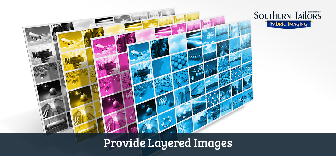
Flattening a Photoshop image means the program merges all the layers used to convert the design into a single-layer image. This is usually done to reduce file size.

However, when submitting artwork for printing, it is preferred to provide the layered files, as the colors of each individual layer can be adjusted if necessary.
What's more, flattening a Photoshop image can pose some disadvantages:
- It is difficult to edit parts of a flattened Photoshop image, because it no longer has the layers used to create it.
- If the image is flattened, only universal color adjustments can be made, limiting true color adjustment and potentially hindering the quality of the final output.
- Additionally, a flattened image may slightly vary from its layered counterpart, especially in tone or transparency.
- Not Giving Additional Background Image Bleed beyond Final Size
Bleed is that area of the artwork that will be cut out when the final product is trimmed, or in the case of fabric imaging, when the hem is sewn.
When working in grand format and other fabric imaging products, there needs to be enough bleed for sewing the hem, or when we need to sew several fabric panels to achieve a larger format.
What are the consequences of artwork having no bleed?
- If there is no bleed beyond the final size, any misalignment when cutting, hemming, or sewing panels together to create grand format images, will result in sloppy artwork.
- Any colors or images of your artwork should extend (or "bleed") into this buffer area. If your image doesn't extend to the borders, bleed is still necessary for hemming.
- Additionally, enough background beyond the final output size should be added for pole pockets.
Leaving enough bleed will guarantee the results you desire.
Many printing companies offer templates to their clients so the artwork meets the criteria to maximize efficiency. You should always ask if they have a template for the type of product you want to print.
- Not Supplying Support Files
In addition to the final artwork file, there are other files that are necessary to ensure that we provide all the tools to achieve the best results.

Some software, such as Illustrator, require that you save all files used to create the design in order to open it properly in another computer. That's why you should provide files in their original format, and include all files and fonts that are in the artwork. Never assume that files are embedded.
If there are any photos, these should be provided, even if they're embedded separately.
- Not Converting Fonts to Outlines and Paths
If your artwork contains any fonts, these need to be converted to outlines or paths. Why? Because if the file is opened on a computer with no access to the original font file, they will be replaced, and hence, the printed results will change.
An alternative to converting fonts to outlines is to provide font packages in TrueType versions.
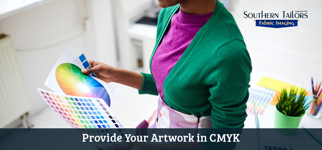
- Not Converting RGB Designs to CMYK
This is probably the most common and bothersome mistake of them all, as it drastically affects the final result.

RGB and CMYK are two entirely different color systems; RGB colors cannot be reproduced in printing without the use of special inks.
- Red Green Blue
RGB is an additive color system. Hues are created by combining solid spectral colors, which are optically mixed when placed in close proximity or presented in a quick succession. The human eye perceives these as one color.
It's the way electronic devices process color. It uses spectral light intensity to create different colors. The more light that is added, the brighter and crispier the color will be.
Computer screens, TVs, cell phones, tablets, and video games all use the RGB color system to create the colors you see.
A good example of how this system works is Newton's color wheel. When the disc or wheel rotates, all the colors blur together and are perceived as one color, depending on the pattern and the colors set on the disc. When all seven colors are included and the wheel is rotated, it is perceived as white.
However, these colors cannot be printed accurately as almost all printing systems use CMYK.
- Cyan Magenta Yellow Key
CMYK is a subtractive color system and is the most widely used in the printing industry.
Colors are created when dyes on an object absorb specific wavelengths of white light and reflect the rest. Any color that we see in "real life" is a result of this subtractive process; the color that we perceive is the reflected color. This is the principle of color printing, where cyan, magenta, yellow are considered the subtractive primary colors.
For dye-sublimation printing, always provide your artwork in CMYK. This way, even if further adjustments are necessary to get the right results, they will be minimal when compared to submitting it in RGB.
- B&W Images Saved in RGB or CMYK Instead of Grayscale
If there isn't any color in the images, a grayscale file is the better option. Otherwise, they'll print with some color on them.
- Forgetting to Do a Spell Check
If your artwork contains text, you should have it proofread before sending it to print. If you're the one doing the artwork, have someone else review it.

The human brain works in funny ways. If you're the author, it doesn't matter if you re-read it ten times, you'll sometimes review and correct it differently than others.
According to this article published on Business Insider, this happens because when we write, we try to convey meaning, so the brain pays more attention to what we want to say instead of the actual words we are typing. A pair of fresh eyes can do no harm.
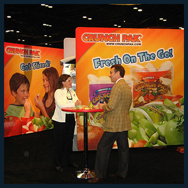
Picture this: you sent a giant Banners that will be displayed in your company's tradeshow booth, to the fabric imaging company and when it arrives
there is a typo!
Fixing it on a computer screen is easy and it will only cost timeprobably less than a minute.
Fixing it once it's been printed is a whole different story. Prints cannot be corrected; all the work needs to be done again from scratch.
You're probably thinking that the printing company should catch typos or grammatical mistakes, and chances are they will, but do you really want to risk it?
Avoiding these nine common mistakes will save you time, money, and headaches.
To make your life easier, we have some templates that we can provide for some of the products we offer. We highly recommend to use them for your art preparation. We also recommend you follow our Digital Guidelines for Dye Sublimation to obtain optimal results.
When in doubt, give us a call at (404) 367-8660, toll-free at (877) 655-2321, or send us a message through the Contact Us form. Our representatives will be happy to help answer any questions you may have about submitting your artwork.
If you found this article helpful, let us know in the comment section below. Also, feel free to share it by clicking the share buttons below. Want us to cover another topic related to fabric imaging services? If so, then like us, follow us, and post to any of our social media profiles the topic you'd like us to discuss: Instagram @SouthernTailors, Facebook Southern Tailors Fabric Imaging, Twitter @SouthernTailors, and Google+ Southern Tailors.
 Corporate & Non-Profits
